Image may be NSFW.
Clik here to view.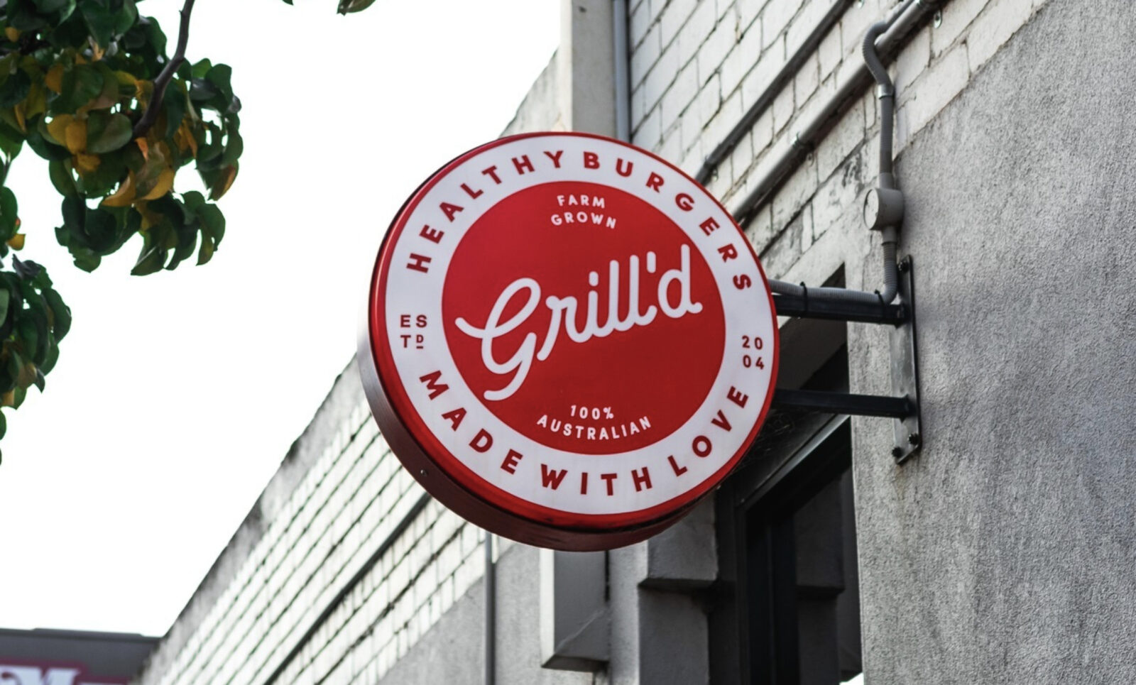
The hidden code
All brands project an image through the visual language of their brand identity. Customers and markets use the code contained within their visual language to make logical and emotional associations that drive their responses to trust, lust, aspire and desire the brand… or not. A well designed brand identity utilizes the visual language code of its market to pin-point the positioning it wishes to own in the hearts and minds of its customers.
When we talk about a brand’s visual language we refer to its brand mark (logo), brand colours and typefaces, and every visual expression of the brand on-line and off including; advertising campaigns, packaging, store design, product names, web site, uniforms, and marketing and shareholder communications. The scope of visual language is unique for every different brand.
Our Visual Decode Process
At Storm and Brand DNA we have become masters of the art of decoding the visual language of brands. This process plays a critical role in the way we position brands once we have defined their strategy and established their market proposition. The visual decode process provides the science that allows us to communicate a brand’s proposition, market positioning and personality based-on the visual cues of its brand identity. The process framework also allows us to provide clients with an informed assessment of the cues currently being provided to the market by their brand identity. The insights provided by this process are often surprising, always informative, and provide a valuable tool for organisations to tweak, adjust or overhaul their brand identity to better serve the objectives of the business.
Image may be NSFW.
Clik here to view.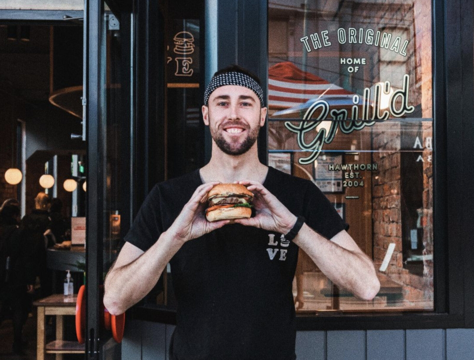
Grill’d for Success
The Grill’d chain of burger stores in Australia are a case study in how to build a fast growing business by creating a new market segment and launching a highly-tuned brand into the over-crowded fast food market. Here we review how the Grill’d visual language positions the brand within its competitive marketplace?
Company: Grill’d
Market: fast food
Brand Canvases: Identity, Signage, Restaurant environment, Product naming, Packaging, On-line, Experiential marketing, Franchisee marketing
Code of Colour
Grill’d‘s primary colour is red. Red has a strong fast food heritage *(think KFC, Burger King, McDonalds, Nandos to name a few). Whilst not providing differentiation, Grill’d use red to effectively communicate which market they’re in, whilst taking advantage of the eye catching properties of the colour red. The smart use of white reversing out of the red for the Grill’d brand mark provides a cleaner, more contemporary and less mainstream look than the competition who typically add a yellow or orange to their palettes.
* In order to differentiate, a brand doesn’t necessarily need to avoid all the visual code cues of the market, it’s more a matter of consciously selecting which parts of the code to adopt, and which to avoid.
The secondary colour palette of ‘toasted burger bun brown’ and black create a unique feel when applied in-store.
Visual Language Code cues provided by Grill’d’s brand identity colour palette:
• Fast Food
• Contemporary
• Warm, Rich, Sumptuous
Image may be NSFW.
Clik here to view.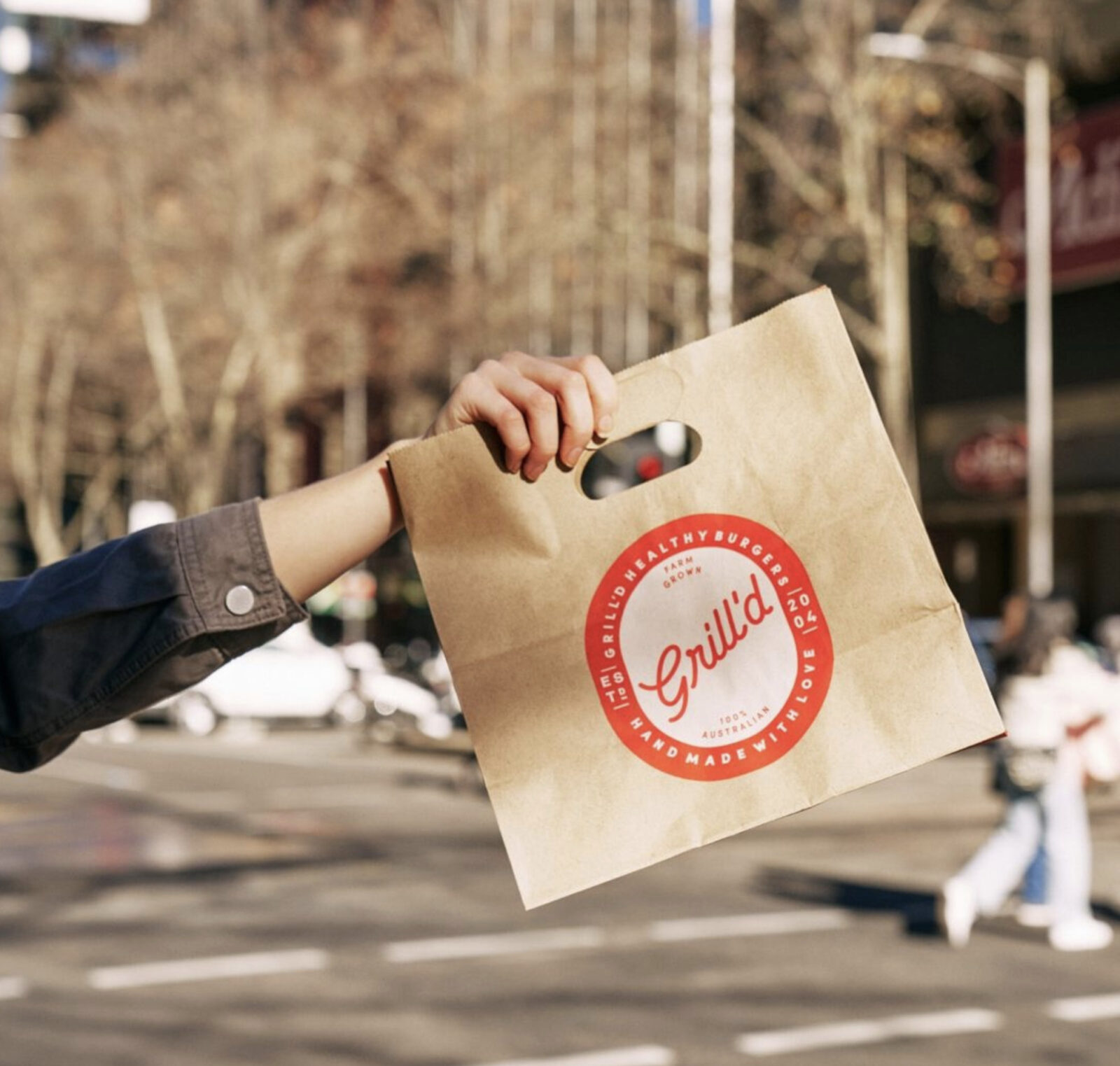
Visual Language Properties
The Grill’d brand’s visual language is rich with unique properties, none more hard working than it’s playful use of illustration. The illustrations have an irreverent, Mambo-like quality to them, providing the Grill’d brand with a defining urban edge. The Grill’d brand mark is a logotype consisting a typeface only with no symbol. The type style is retro inspired, connecting the brand to the golden era of fast food, when the ingredients were pure and unadulterated. At a secondary level, the Grill’d brand identity uses scrawled hand-writing to communicated on walls, bags, menus and uniforms. These elements combine to give the Grill’d brand a look that is unique within the market. This rich palette of visual language allows Grill’d to free-style the application of its brand identity, providing a sense of authenticity and avoiding the ‘plastic wrapped look’ of the major fast food chains.
Visual Language Code cues provided by the visual language properties of the Grill’d brand:
• Retro Fast Food Heritage
• Urban Cred • Ireverant, cheeky personality
• Youthful attitude
• Authentic burger joint, not cookie cutter franchise
Image may be NSFW.
Clik here to view.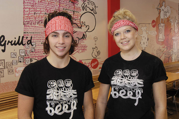
Dialing-up the Personality
The Grill’d brand personality comes through loud and clear through all of it’s communications. The Grill’d way of doing things is clearly unique to its competitive market, and whilst it has enough flexibility to remain fresh, relevant and authentic, it all springs from the same well of Grill’d-ness. We cannot complete an assessment of the Grill’d brand’s visual language without covering-off its brand language. Although not strictly part of the visual language, it provides a rich example of the use of rich brand language as a powerful market differentiator. The Grill’d brand language is personality filled with a rich youthful, urban attitude. Product names include the Kung Fu Fighter, the Hot Mama and the Zen Hen. The Grill’d tag line is ‘Healthy Burgers for a Healthy Mind’ and painted on the walls of it’s restaurants are brand positioning slogans like: ‘No drive through, no clowns and no goddamn Colonel’.
Brand positioning cues provided by the brand language of Grill’d:
• Urban Cred
• Ireverant, cheeky personality
• Youthful attitude
• Healthy burger offer
Image may be NSFW.
Clik here to view.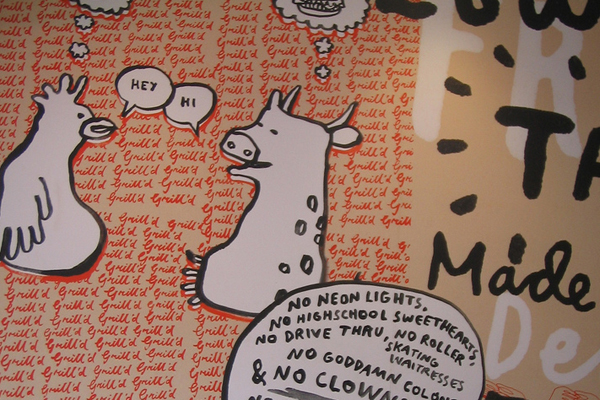
Step 01. Crack your code
Every industry has an underlying visual code that customers utilize to pin-point the position and proposition of the businesses that are competing in that market. Do you understand the code for the market your business is competing in?
Step 02. Clarify your Go-to-Market Proposition
Once you understand the competitive landscape of your marketplace, establish you most competitive position within that landscape. Determine what positions the leading brands occupy? What positions are available that you can own and dominate? Ask yourself, ‘is there a large enough market of customers out there for me to grow my business?’ (McDonalds and Burger King were competing for the burger market, So Grill’d created the Healthy Urban Burger market). And finally, do you have the skills, experience and knowledge to deliver on your go-to-market proposition?
Step 03. Leverage the code of Visual language
Decide which elements of your market’s code of visual language you will leverage, and which you will differentiate with. As a rule of thumb, a new player looking to quickly establish their brand in a market will leverage most of the visual language code of that market, whilst a dominant player wishing to create a challenger position (similar to the Virgin approach) will leverage as few of the cues of a market’s visual language as possible.
Image may be NSFW.
Clik here to view.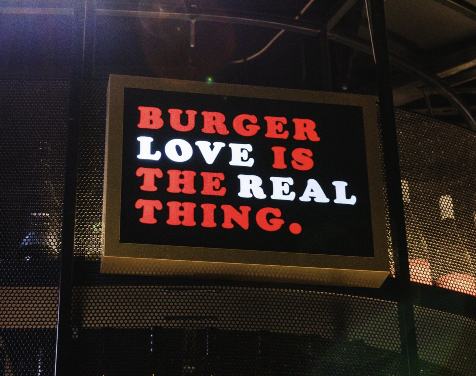
Don’t try this at Home
The process of decoding, development of a go-to-market proposition, and leveraging of your markets visual code can be complex. Our process and skills have been honed over nearly twenty years of working with hundreds of brands in almost every different market conceivable. If you find this process to be confusing, get in touch and we’ll help show you the way.
Dave.
Pics from Grill’d Instagram.
The post Unlocking the hidden code of your brand’s Visual Language appeared first on Truly Deeply - Brand Strategy & Creative Agency Melbourne.